


THE BRAND
"Protect" is a company that creates the perfect combination of insulating materials, diffusion membranes and films for roofs. Their products provide unsurpassed protection against external influences. The company offers advanced technology, quality, reliability and comfort to make your home a real refuge.
It was decided to redesign the logo for the company "Protect". The challenge is to create a beautiful and effective logo that reflects the company's commitment to innovation and leadership in roof protection. The logo will embody the modernity and progressive spirit of the company, as well as emphasize their expertise and reliability. This redesign will help them enhance their reputation and attract new customers, showing that Protect is a company you can rely on and trust.
---
COMPLETED:
Kevchenkov Sergey
WEBSITE:


LOGO
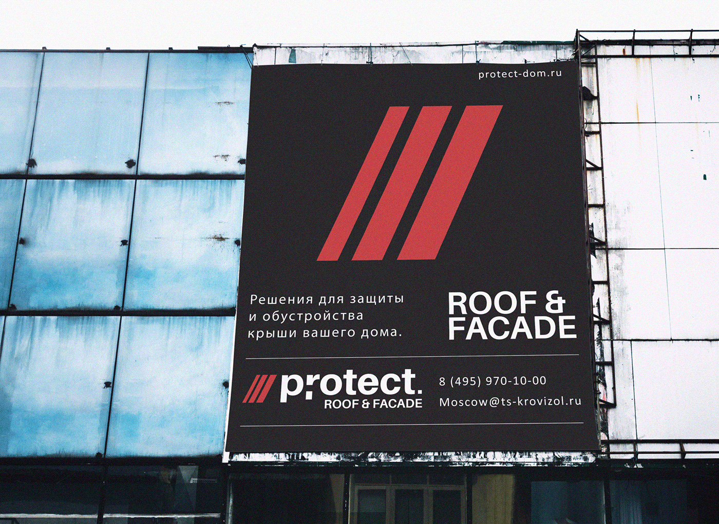
The color scheme with red emphasizes energy, passion and strength, while white symbolizes purity, honesty and security. This combination of colors creates a bright and attractive image that will attract attention and be remembered by the target audience.
The logo also features the name "Protect" in the font "Aileron". This font is one of the most modern, unique and easy to read. It emphasizes the professionalism and innovative approach of the company. Also, minimalism in logo design is trending right now and this gives this logo a competitive edge as it stands out from other more complex and overloaded designs while providing a modern and stylish look.
Below the name "Protect" is the additional phrase "roof & facade". This clarification clearly indicates that the company specializes in the protection of roofs and facades. This helps to clarify and emphasize the company's field of activity, strengthening its position in the market.
The logo also contains three red vertical lines, which symbolize the protective layers for the roof. These lines emphasize the importance and necessity of quality protection, and also give the logo structure and depth.


OUR APPROACH
This approach is based on conducting intensive research to fully understand Protect's unique value proposition, target audience and market positioning.
The redesign of the "Protect" logo is aimed at construction companies, architects, repairers and private owners, emphasizing the high quality and reliability of insulation materials, as well as the importance of roof protection and energy efficiency of buildings.
The results of the study are translated into a brand strategy that will be based on the principles of sustainability, innovative design and customer satisfaction. Key messages are being identified to be shared across all branding and marketing materials.
The results of the study are translated into a brand strategy that will be based on the principles of sustainability, innovative design and customer satisfaction. Key messages are being identified to be shared across all branding and marketing materials.

THE FUTURE
In working on the logo redesign for "Protect", there is a desire to create a brand that remains dynamic and responsive to an ever-changing market.


